April 5, 2008 10:02 am
Published by tnels
Okay, so I have finally gotten to this post. I guess I took the whole week off. I gotta be more disciplined. Anyway…
One thing that angered me about Safari 3.1 was its @font-face support. This allows developers to load fonts that may not already be on someone’s computer and use them anywhere in the site. This could be a totally awesome tool, however, I thought, “Why the hell is Safari trying to become IE?”
What do I mean by that statement? Well, the reason the IE sucks to develop for is because it is too busy trying to support older websites that don’t gracefully degrade. The developers were too busy trying to get the site to work in a patched together browser, so standards weren’t followed. This comes from the fact that IE attempted to create it own standard (as did Netscape) because they were all attempting to monopolize the internet.
Anyway, so we have Safari attempting to, in my view, add its own specification to CSS. Turns out I’m wrong. The @font-face selector is actually a part of the CSS3 spec. However, CSS3 is not fully “approved” even though it is supported. I’m not really sure how that works, but I’d really like to see some definite approval before we see support.
So I guess @font-face is all good. Soon we’ll be seeing websites in font other than Arial, Verdana, Tahoma, Trebuchet MS, Georgia, Times, and fantasy? Almost. Turns out you have to host the font files on your server, in a readable directory, so you can’t put up commercial fonts because all users will have to do is read your CSS (thanks Firebug!) and navigate to the font file and download it. Not good. So we are stuck with Open Type fonts. Which can be good, and are getting better, but they’re no Din.
But wait there’s more! You can load other fonts with this handy little tool known as sFIR. sFIR is awesome because it replaces your headings with Flash files that have the font’s embedded. It gracefully degrades (if someone doesn’t have Flash, they get the heading in your default font style). It also has limitations. sFIR is no intended to be used for mainbody text, only small chunks, like headings. And the person needs Flash (who doesn’t have it now-a-days?).
For more on @font-face and how it works, check out this @font-font explanation.
March 27, 2008 11:27 am
Published by tnels
Recently I have come to the realization that I spend so much time in production that I rarely get to search for things that would be useful, big picture resources/learning for future projects. Basically, I’m bad at keeping up with where CSS and HTML are going. And since I am trying to really push myself to have better skills to contribute to not just my current position, but the world at large, I have found a bunch of great resources.
I have to admit that having a blog and wanting to write well researched and thoughtful articles has really contributed to this. I’m still brewing my last critique of Safari 3.1, and in the process of doing research around this have discovered quite a bit of cool stuff (by the way, my writing still sucks, I use words like stuff too much). So I thought I would list a few way to deal with IE issues.
- Eric Meyer is the man, and give us this bit of code to break some of the major issues you will run into with IE. You can see them at his Reset Reloaded article, which I found on this webiste, Keys to Consistent CSS. Here’s the code in case you are too lazy:
html, body, div, span, applet, object, iframe,
h1, h2, h3, h4, h5, h6, p, blockquote, pre,
a, abbr, acronym, address, big, cite, code,
del, dfn, em, font, img, ins, kbd, q, s, samp,
small, strike, strong, sub, sup, tt, var,
dl, dt, dd, ol, ul, li,
fieldset, form, label, legend,
table, caption, tbody, tfoot, thead, tr, th, td {
margin: 0;
padding: 0;
border: 0;
outline: 0;
font-weight: inherit;
font-style: inherit;
font-size: 100%;
font-family: inherit;
vertical-align: baseline;
}
/* remember to define focus styles! */
:focus {
outline: 0;
}
body {
line-height: 1;
color: black;
background: white;
}
ol, ul {
list-style: none;
}
/* tables still need 'cellspacing="0"' in the markup */
table {
border-collapse: separate;
border-spacing: 0;
}
caption, th, td {
text-align: left;
font-weight: normal;
}
blockquote:before, blockquote:after,
q:before, q:after {
content: "";
}
blockquote, q {
quotes: "" "";
}
******Update*******
The above is the old version of the reset. Eric Meyer has a new version of the browser reset, posted Jan ’08.
- Another great resource is Dean Edwards IE7 JavaScript library, which fools anything less than IE7 into thinking its IE7. Initially I thought this was awesome. Then I realized it made me lazy. Then I thought it was too big. Now I’m so good, I don’t need it (which is partially true). Version 2 has gotten much smaller, but is still in Beta.
- Hacks. As much as I love them, they create invalid CSS. You can use _ before your propertiess to target IE6, and * before them to target IE7 (which also targets IE6 by the way), or both to create properties that affect both:
/* Target IE 6 and below*/
#maincontent {
width: 400px;
_width: 410px;
}
/* Target IE7 and below */
#maincontent {
width: 400px;
*width: 410px;
}
/* Target IE6 and IE7 separately. ***Make sure to put the IE6 ("_") property second*** */
#maincontent {
width: 400px;
*width: 410px;
_width: 415px;
}
Let me be absolutely clear, I do not endorse hacks, but I have been known to use them in a pinch (a fact that I am not proud of).
- And here’s my preferred method, Conditional Comments, which you can use to have specific stylesheets for different browsers. Make sure you put these after your global stylesheet(s) so they properly override the styles.
March 26, 2008 6:48 pm
Published by tnels
Okay, so not much of a big deal for those of you who are actually reading this (which means no one besides myself), but it cracked 57 here in Boston today. I could get used to this. Only a couple months until it gets brutally hot, so I might as well enjoy it.
March 25, 2008 2:27 pm
Published by tnels
This is hands down the issue that will covert me to using Safari. I live and die by Firebug at work. It has so many applications, the most amazing of which is the ability to edit styles and see live updates without switching between programs. Plus you get to see all your CSS properties right next to each other, so if you over somehow over-ruling a style you can see how best to go about fixing your problem. Plus you got the DOM right there to help your JavaScript.
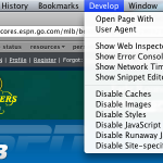
So now this feature comes built in. Here’s how to enable the Safari develop menu.
It works pretty similar to how Firebug does, however, there is some additional coolness/drawbacks.
What’s the same
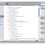
It starts as a menu item, but of you hit option + command + i, you get a pop-up version of the Web Inspector (of you can go to the Develop menu and select Show Web Inspector). Firebug begins in the same window as the page you are, but you can open it in a separate window after that. Starting in a separate window is nice because you can see the whole page without any obstruction, but you can always click the bottom right hand corner to open the Inspector in the same window. I should point out that there is no button to close the Inspector once it is in the same window was the page, which totally blows (and even the option + command + i shortcut doesn’t close it).


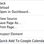
Another great feature is the “Inspect Element” option. If you right click on element, you will see it at the bottom of the option menu. This is another feature borrowed from Firebug.

They both have features that let you get into the DOM, they just have different titles. In Firebug, its called “DOM”. In Web Inspector, DOM properties are found under “Properties”. I think this is Apple’s subtle way of merging the way people thing about HTML and JavaScript (as two separate languages) into one unified structure. While they both do separate things and operate as separate languages, there really isn’t much difference when it comes to the end user. Plus one (JavaScript) is generally useless with out the other (HTML).
What’s Different
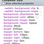
When it comes to styles, you get sort of the same treatment, you can see all the styles for a given element, as they broken down by CSS properties. Web Inspector gives you a nice feature by listing all the applied styles first, regardless of where the property is coming from, and then it lists them by selector. However, you cannot edit this “Computed Style”; you have to scroll down some more and find the real style.

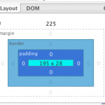
Another main difference between Firebug and the Web Inspector is when an element is highlighted (or inspected). Firebug has a color coded system, so you can see the element size (in blue), the padding (in purple), the border (in grey), and the margin (in yellow).


Web Inspector grays out the screen, except for the element, so you can really focus in on it. But you are missing the box model elements, which can come in handy.

Layout vs. Metrics
They both a way of breaking down the box model in useful terms, but I still like the Firebug implementation. Firebug has what it calls “Layout” which shows all the measurement applied by the box model (including offset), and when you mouse over one of them, overlays a ruler for the X and Y on your site and shows you where your boundaries lie within that. This can be great for aligning elements, and helping improve typography.


Web Inspector has what it calls “Metrics”, but it stops there. It does show you all the measurements of the block but it lacks to in browser display you get with Firebug.

General look and feel
Firebug goes for a tabbed layout, so everything works similar to how your browse. Web Inspector goes in a different direction and breaks each file down by type, and allows you to access them in this way.
It basically reinforces the Aqua branding of Safari and borrows lots of its style from other Aqua interfaces. I kinda like this because Apple has a great approach to Usability. It does reinforce to the user that all of these styles come from different files, but in the end get put together by the browser. Firebug breaks everything down by type, but doesn’t necessarily draw the distinction (at least not directly) of where all this info is coming from.
Browser Defaults
This is a key component, especially for people who are learning, and it is found only in Web Inspector, and that is browser defaults. Web Inspector gives the user the ability to enable “Show Inherited Properties” which shows the user the browser defaults for each element. For a web developer this is crucial. I think the IE7 developer tools attempts this, but still doesn’t let you know about the 2 pixels of hidden border (I highly recommend “border-collapse:collapse;” make it into every stylesheet you create).
This does let you know about how Safari interprets everything, which I like because there are a few things that Safari interprets a little differently than I am used to. Standards compliance is a scary thing. Because it means you will actually get what you want.
Conclusion
Overall, I haven’t had a ton of experience with the Web Inspector yet, but I do like where it is going. Soon it will be on par with Firebug, and maybe surpass it. But until then Firebug is awesome, and I’m loving that browsers are adding built-in development tools, for lazy developer trolls like myself.
Next up, Part 3, Why Apple pissed me off with 3.1…
March 25, 2008 9:52 am
Published by tnels
Lately, I am becoming more and more a fan of Safari.
The Past
One of the reasons I never really used it in the past was because it was just a browser, and, as a developer, while testing in it was necessary, I would never actually use it while I was setting things up. Here are some more reasons I never used it:
- I support Firefox for everything they have done to kill IE
- Camino does the same stuff (and is getting better at it all the time)
- Only one theme/skin
- I really enjoy live bookmarks instead of RSS aggregators
- Sometimes Javascript can be a pain (ever use tinyMCE?)
- Web Developer toolbar
- Firebug
The Present
But now that is changing.
- Its fast
- Safari now supports RSS feeds in the browser, still no live bookmarks, but its a start.
- I’ve fallen in love with Aqua, and I don’t mind the look of Safari in Leopard (but I think some of the buttons are a little large and awkward).
- Firefox is becoming a slow beast that is killing my browsing experience, but I’m really excited about 3.0. I have a whole other post brewing about what went wrong with Firefox.
- Camino is still there, but for some reason, it just not exciting anymore.
- Last but certainly not least… Safari has a Develop Menu in the Toolbar!!!!! Its not as advanced as Firebug (yet) but it gives an amazing amount of depth into how Safari renders everything, which is useful (and awesome!)
Stay tuned for more on the Develop Menu in Part 2…
March 24, 2008 9:10 am
Published by tnels
I recently bought a new car, and because of this, I get a lot of mail. Lots of companies want my opinion on 30,000 different aspects of the car, as if my opinion was actually worth something. Sadly, I just don’t have enough time to give to these companies. One of them was nice enough to include a fresh dollar bill in the envelope, which was enough for me to actually look at all 40 pages of questions it had before I trashed it.
Anyway, one company sent me some information on how Volkswagon, I got a GTI, is supporting their movement to reduce carbon emissions. They are called Carbon Fund. Very interesting stuff. But what was more interesting was their logo, which looks a lot like the logo of a certain presidential candidate. I assume, since Carbon Fund as been around since ’03, that their logo came first. Here they are, in all their glory:
I am not a designer, but I do work with designers, and I know that they get inspiration from various places. Both of these are aiming at an awakening, to show that something is on the rise, but its not going to happen with just logos and good intentions.
Check out their websites to learn more, Barak Obama and Carbon Fund.
March 22, 2008 9:00 am
Published by tnels
Okay, I’ll admit it, I didn’t design this template. And I probably won’t design any template you ever see on this site. As gifted as I am, I am terrible at design. I have great attention to detail when it comes to looking at HTML. I can spot the reason your site doesn’t validate in less than 5 minutes (without looking at the validator results). Please don’t think less of me.
Oh yeah, welcome to my blog! I am trying to figure out what voice to use with all of this. I imagine myself sounding very authoritative with everything I point out, trying to sound like I am some sort of authority. I am not an authority on anything, except how not to be an authority. Now that I’ve lost all my potential repeat viewers, I’m going to end this post. See you soon!
