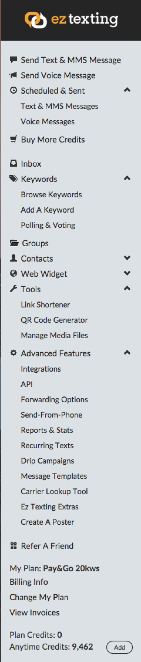
Understanding the Problem
We knew that the information density in the sidebar was a major distraction for users. To determine how impactful this was, we ran a heat map on the entire application. We observed new users would click through the sidebar to understand what each menu item meant, but the further down they got the more likely they were to abandon. They were trying to orient themselves and feeling overwhelmed by the complexity.Goals
- Reduce clutter and cognitive load
- Give focus to the sidebar
- Improve access to most used items
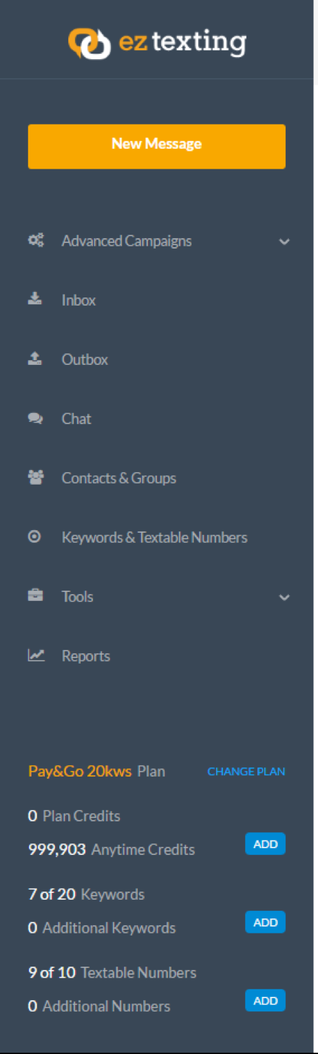
Design
- Card sorting exercise with internal stakeholders
- Regrouped items based on their usage and recommendations from our card sorting
- Ordered based on frequency of use gained from analytics
Results
- Released as A/B test – 30% of new users on the new sidebar
- We saw a 30% increase in conversion and a 50% drop in chats related to finding features in the application
Before and after screenshot of the solutions